Family industrial real estate business
A logo, brand guidelines and a one-page website for a family-owned company that buys and runs industrial buildings in Chester County. They started with nothing online and launched about two weeks later.
The brief
Put a family business on the map, without making it feel like a sales pitch.
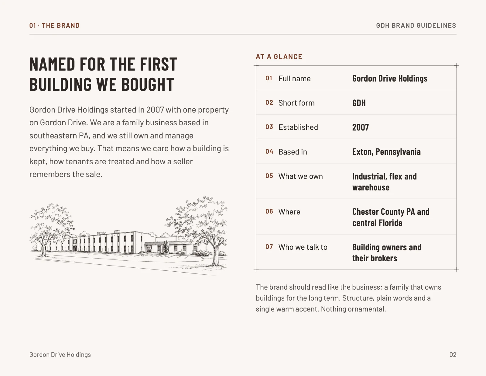
Gordon Drive Holdings has owned and managed buildings in southeastern PA since 2007, starting with one property on Gordon Drive. That is where the name comes from. Until now they had no logo, no website and no presence online at all.
They wanted a simple, credible place to say who they are and what they buy, so that building owners thinking about selling, and their brokers, can find them and reach a member of the family directly.
How we worked together
One conversation to start, one main contact throughout, and one big reveal for the whole family.
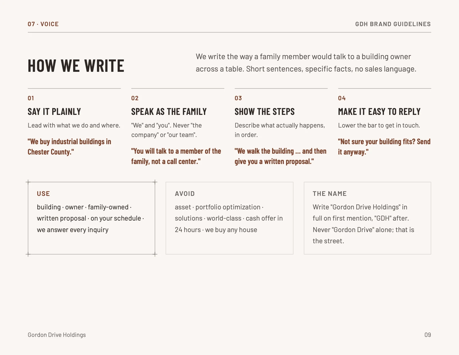
We started with a kickoff call: an open conversation about their goals for the site, the look and feel they had in mind, and how they wanted to sound. Professional, but still a family talking to a building owner.
From there we worked with one main contact at the business through the logo, the brand and the site. When everything was ready, we presented the finished work to the whole family at once. They loved the look and feel and said it felt unique and professional. A few copy updates later, the site went live.
It was a lot of fun working with another small business. We could relate to each other.
- Kickoff call
- Logo and brand system
- Website design and build
- Presentation to the family
- Copy updates, hosting and launch
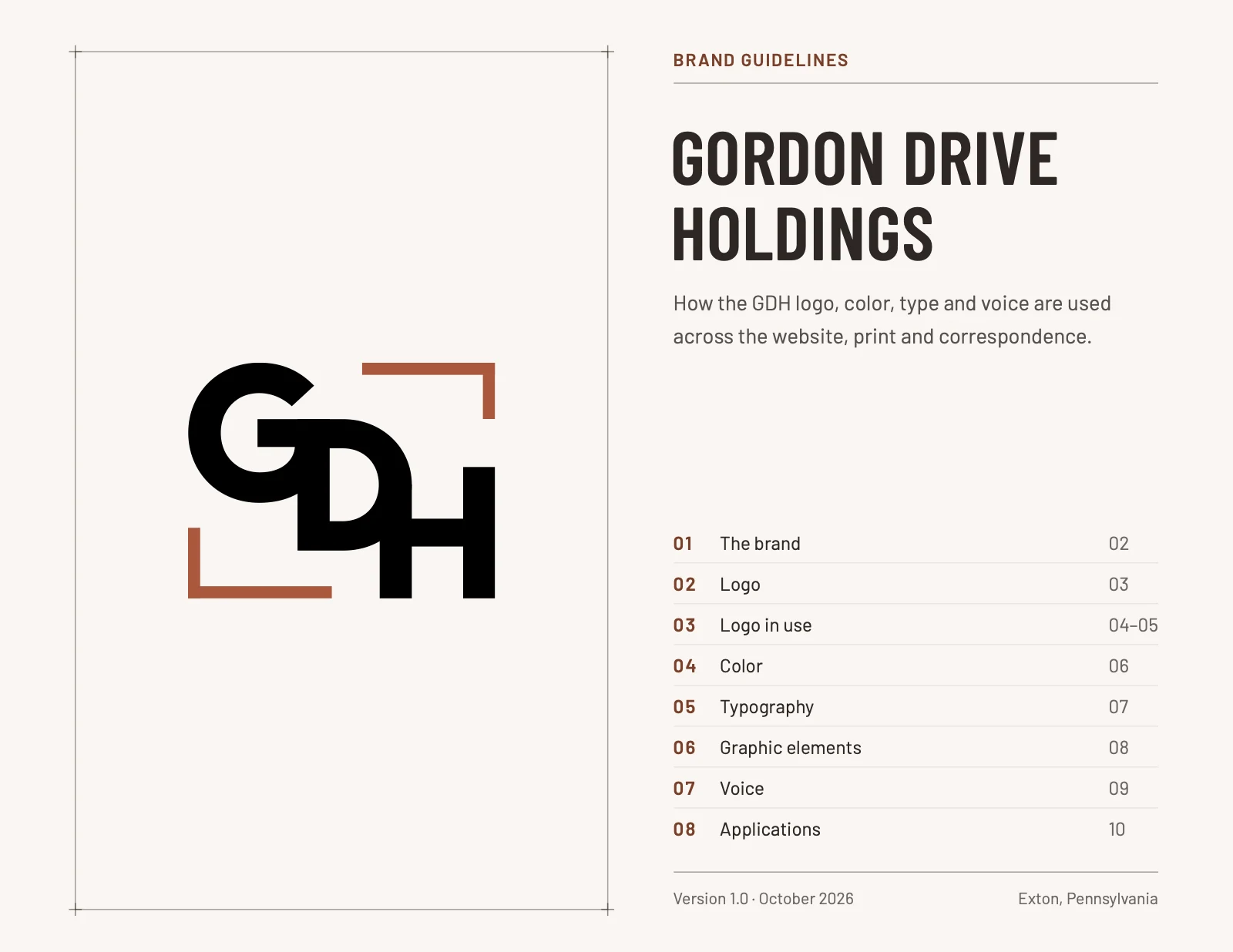
A logo drawn like a plan
Structural, a nod to architecture, clean, and readable from across a parking lot.
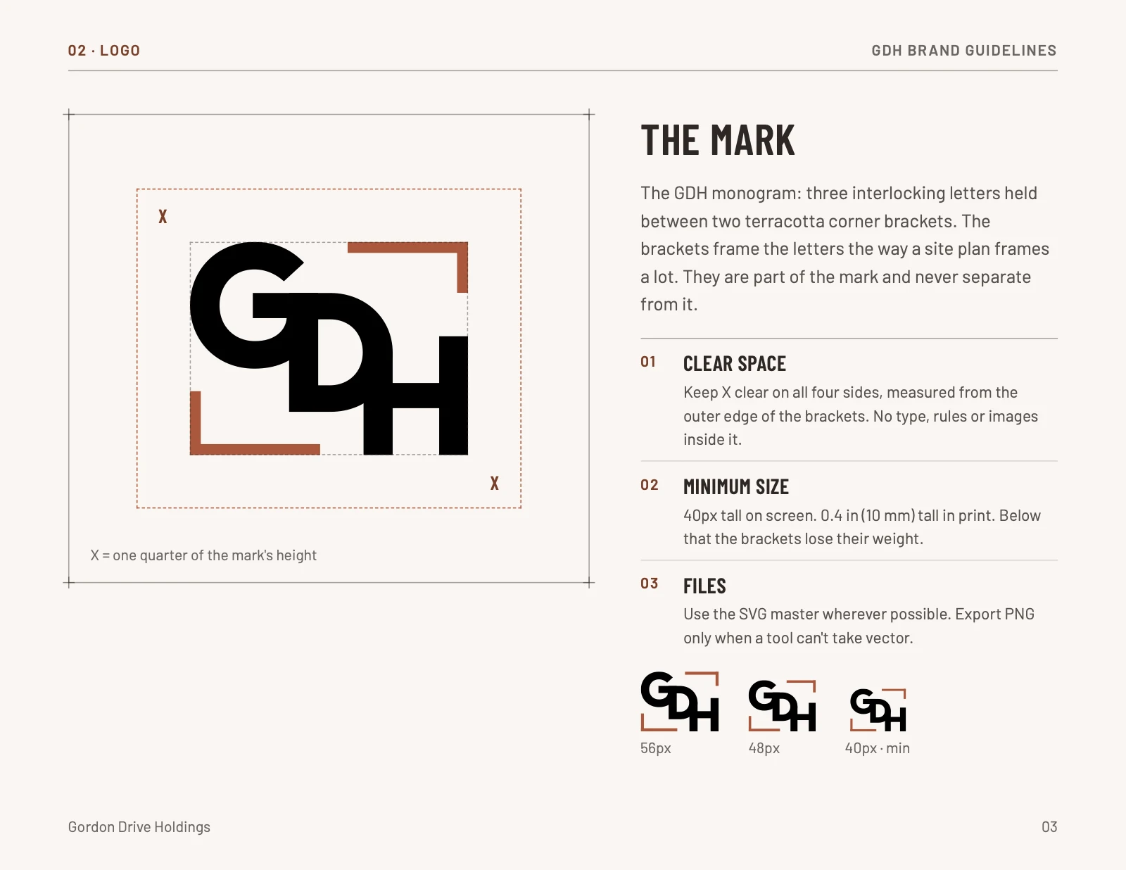
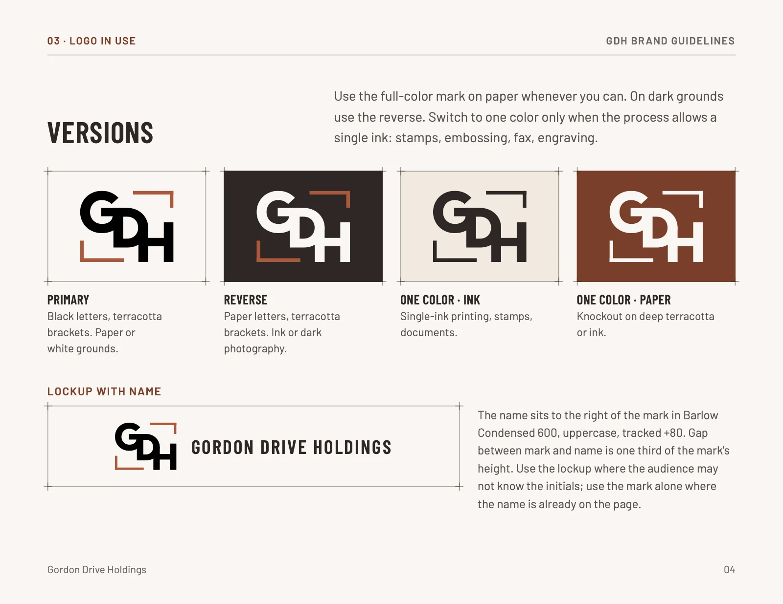
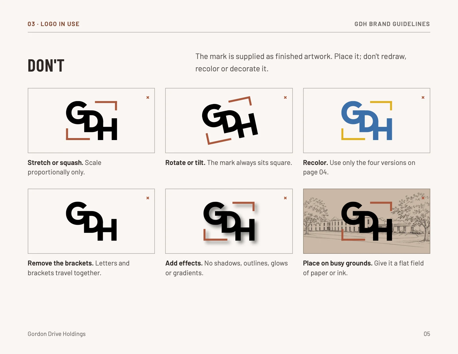
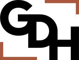
The G, D and H stack and interlock the way a stairwell climbs through a building. Two terracotta corner brackets frame the letters the way a site plan frames a lot, or the way survey lines mark the edges of a property.
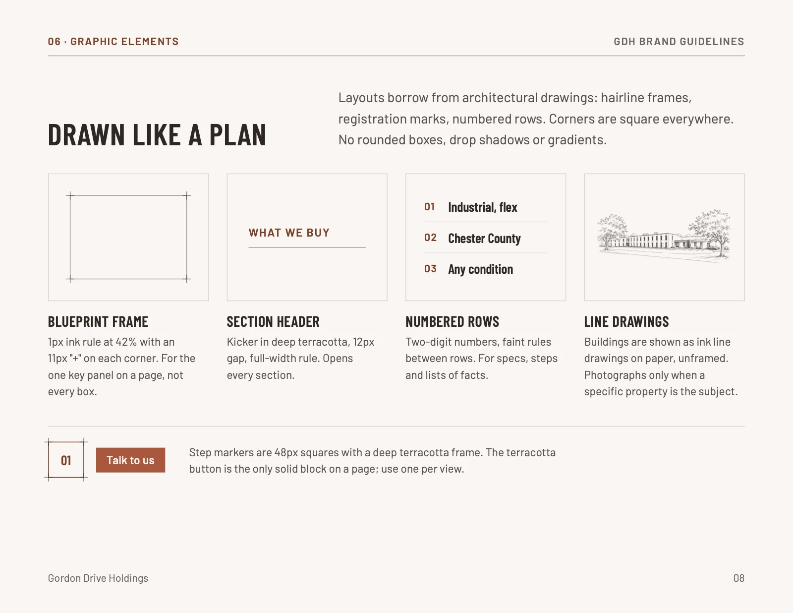
The brackets also brought the brand its second color, and the same corner detail carries across the website as the small cross marks at the corners of each section.
Brick, paper and ink
One warm accent, used for one thing on each page.
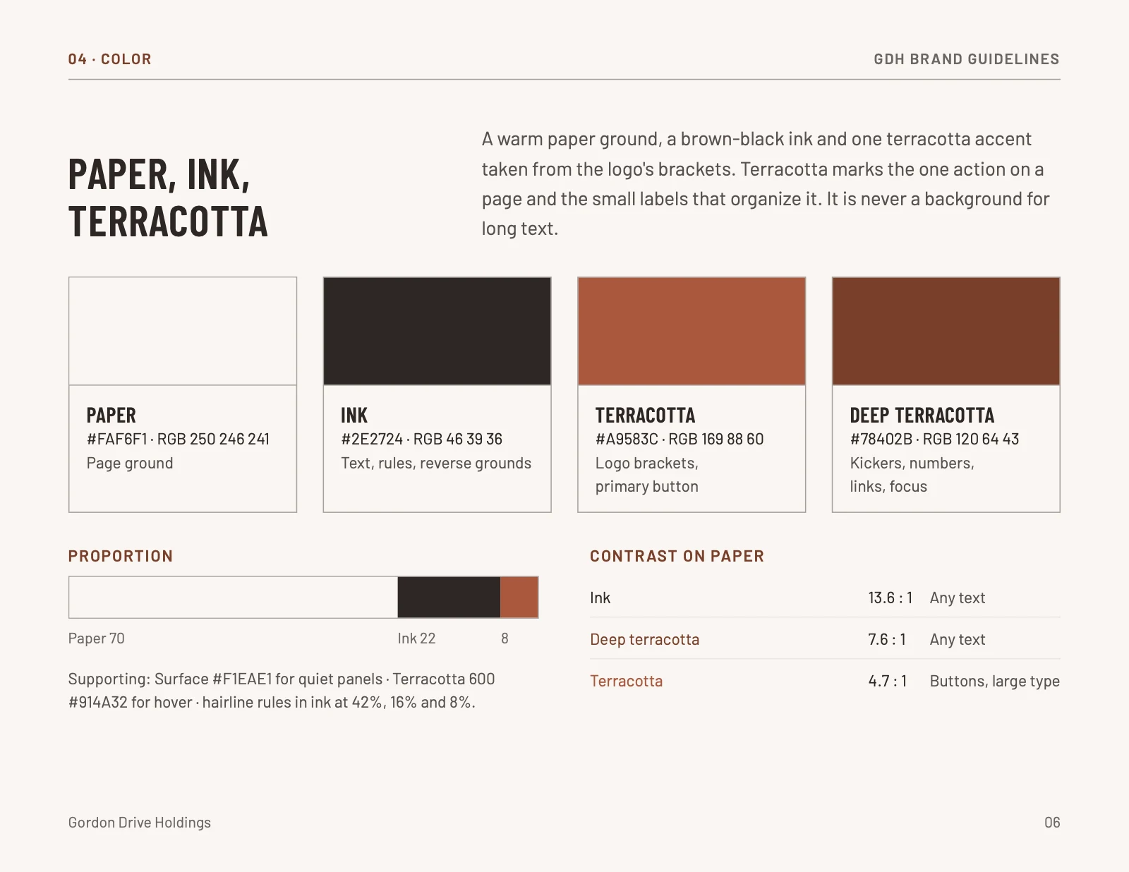
Terracotta is a nod to brick, one of the most common materials in a building, but it still sits quietly as a neutral. They did not want anything loud or overly colorful, so this brings in warmth without being in your face. Everything else is warm paper and a brown-black ink.
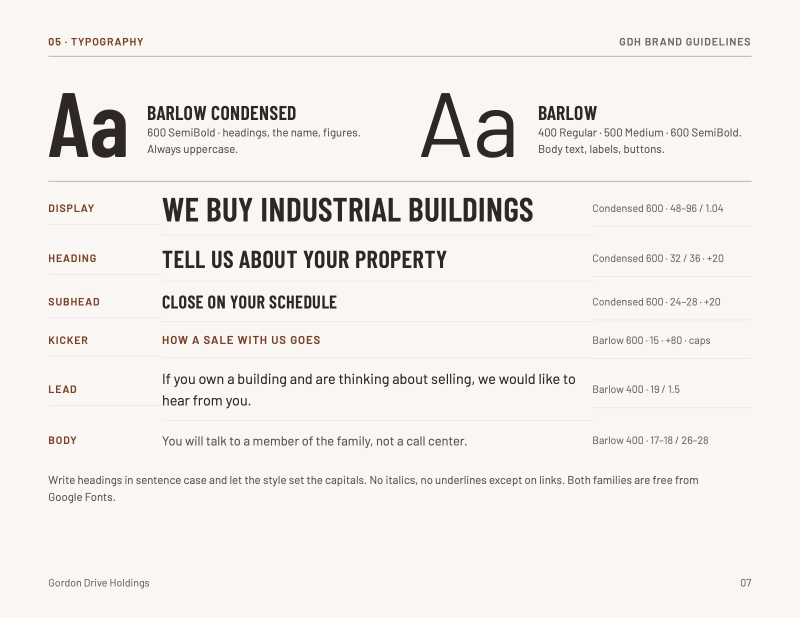
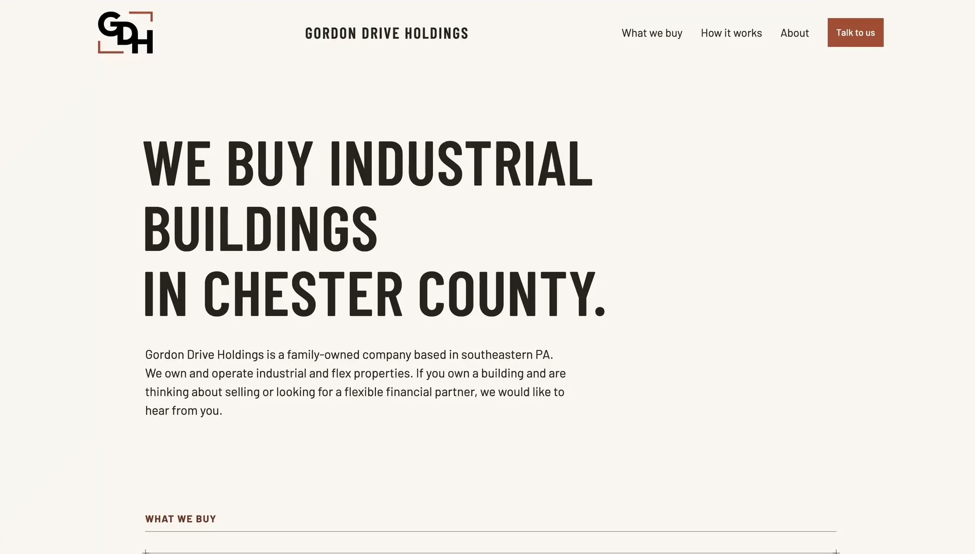
Headlines are set in Barlow Condensed, all in capitals. It fits the space and gives the type a structural feel, so the first thing you see on the site says plainly what they do: we buy industrial buildings in Chester County. Body text is set in Barlow, its regular-width partner.
- Paper
#FAF6F1 - Ink
#2E2724 - Terracotta
#A9583C - Deep terracotta
#78402B
The website
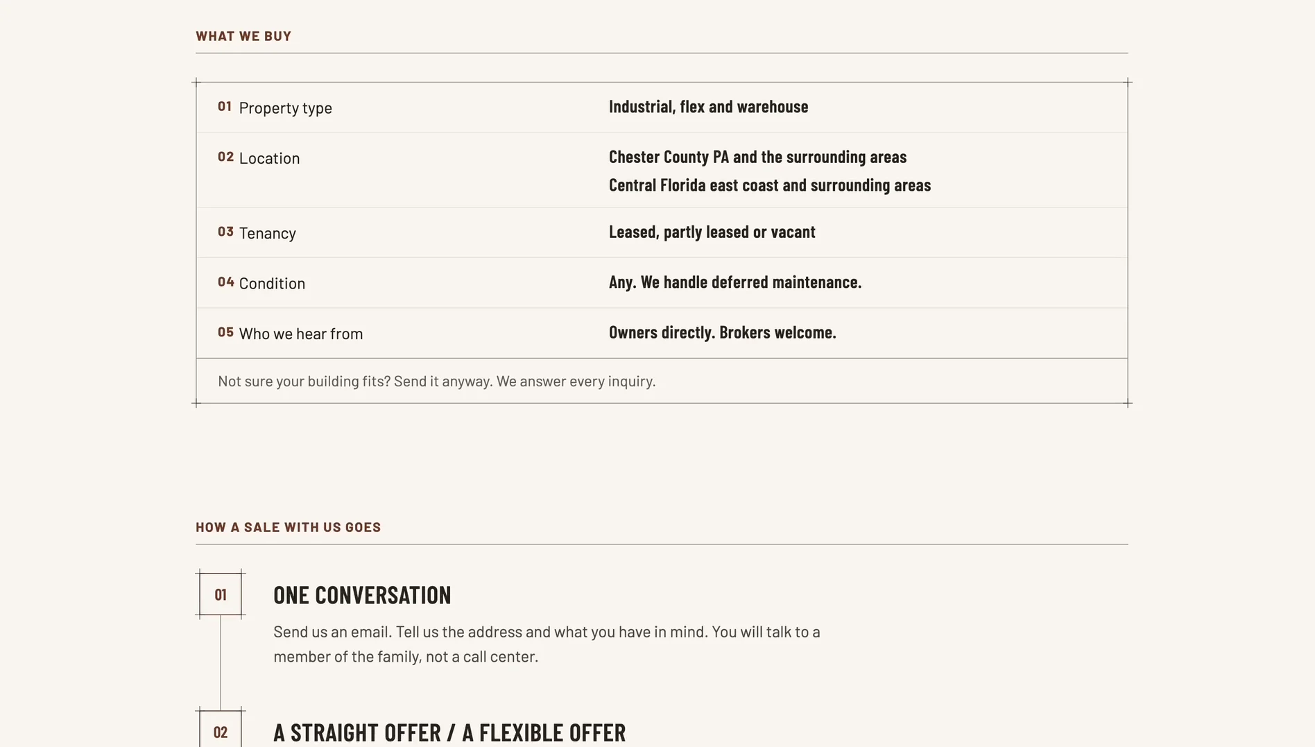
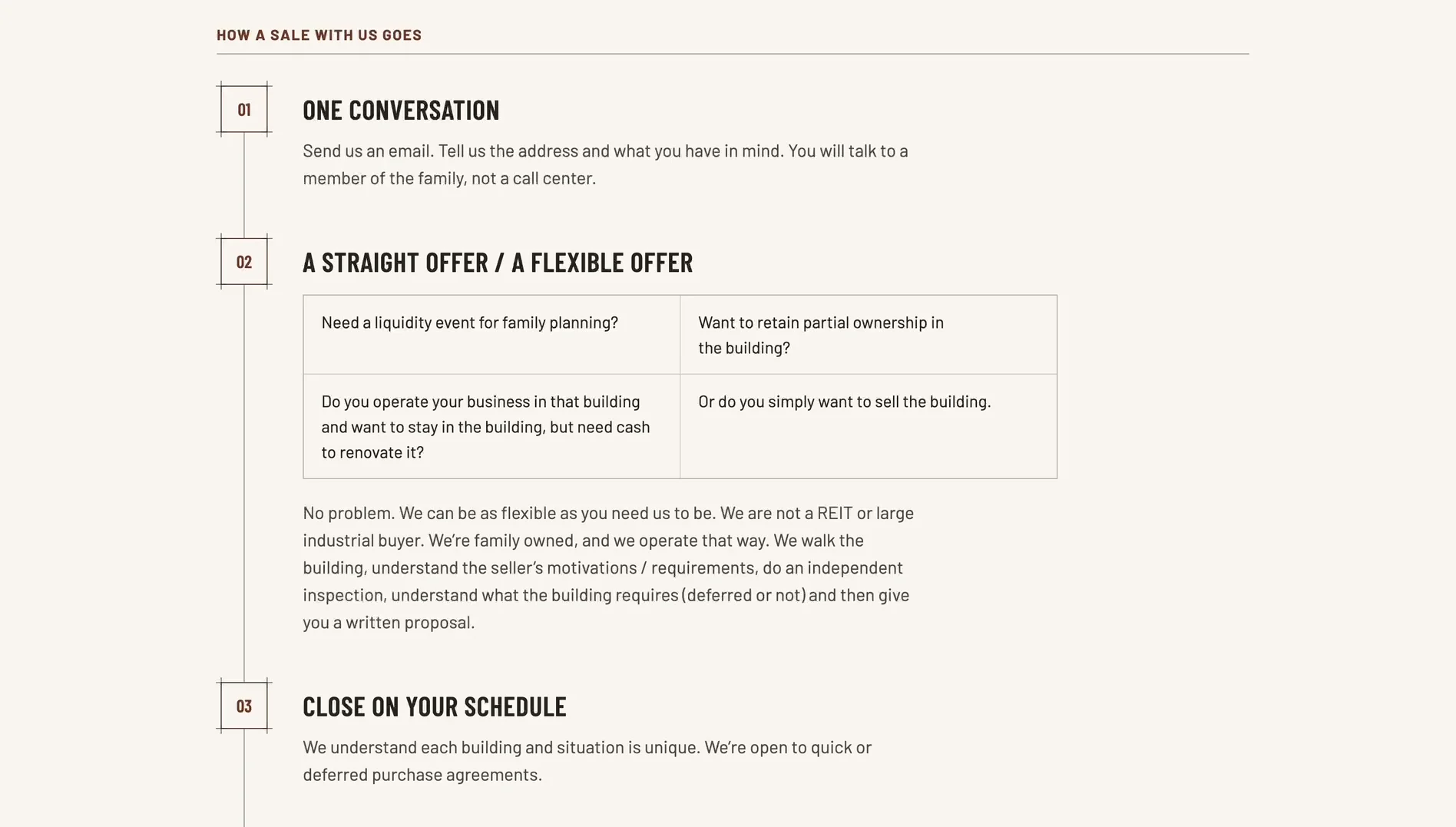
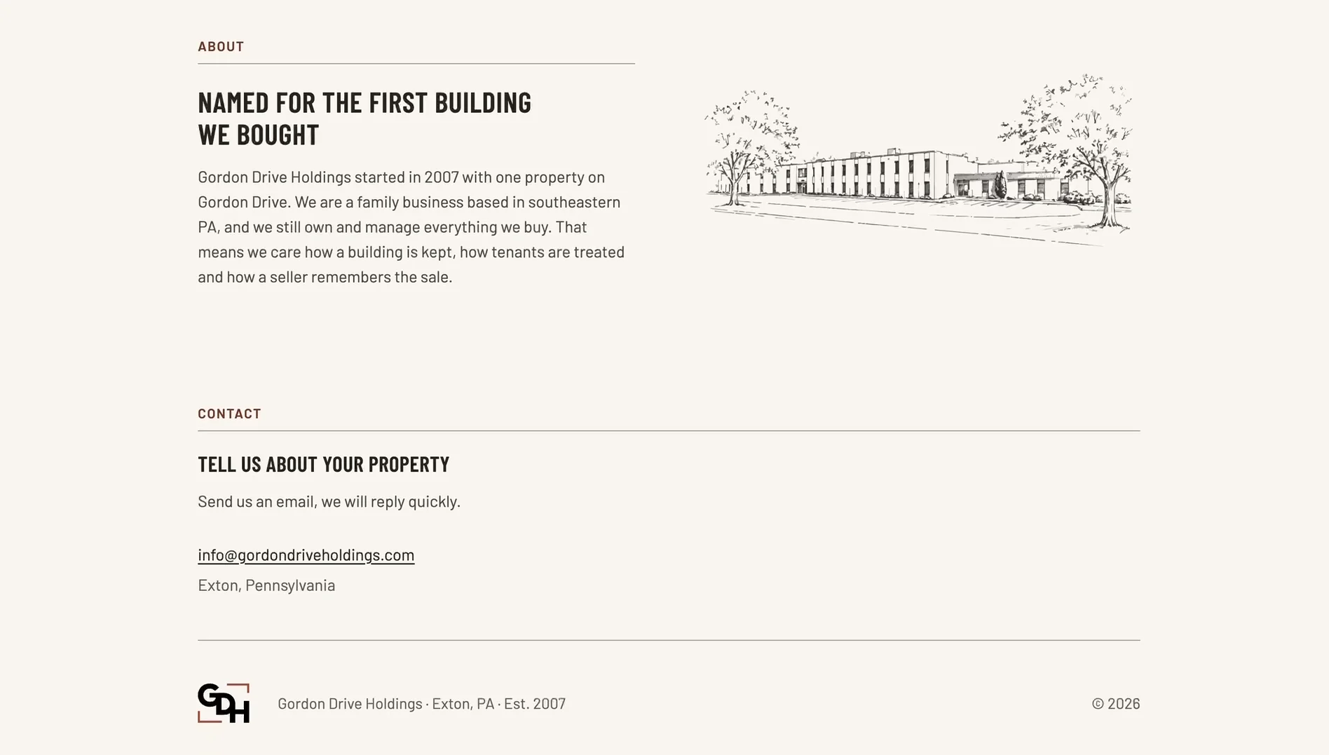
One page, four sectionsWhat they buy, how a sale with them goes, who they are and how to get in touch. The layout borrows from architectural drawings: hairline frames, registration marks and numbered steps.
Brand guidelines
Logo, color, type, voiceEverything above, written down: how the logo is used and not used, the palette, the type, the graphic elements and how GDH sounds. The next person who makes a sign or a business card for them will not have to guess.